# Tabs
Kickstand UI's tabs component are a useful way to group related information in a discoverable way.
<ks-tabs>
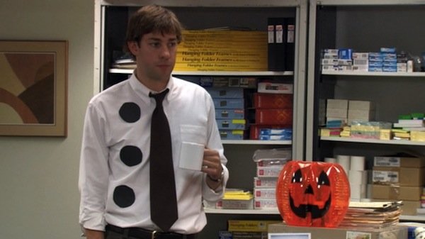
<ks-tab tab-text="Three Hole Punch Jim">
<img src="/images/demo/costumes/three_hole_punch_jim.jpg" alt="three-hole-punch jim" />
</ks-tab>
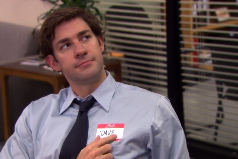
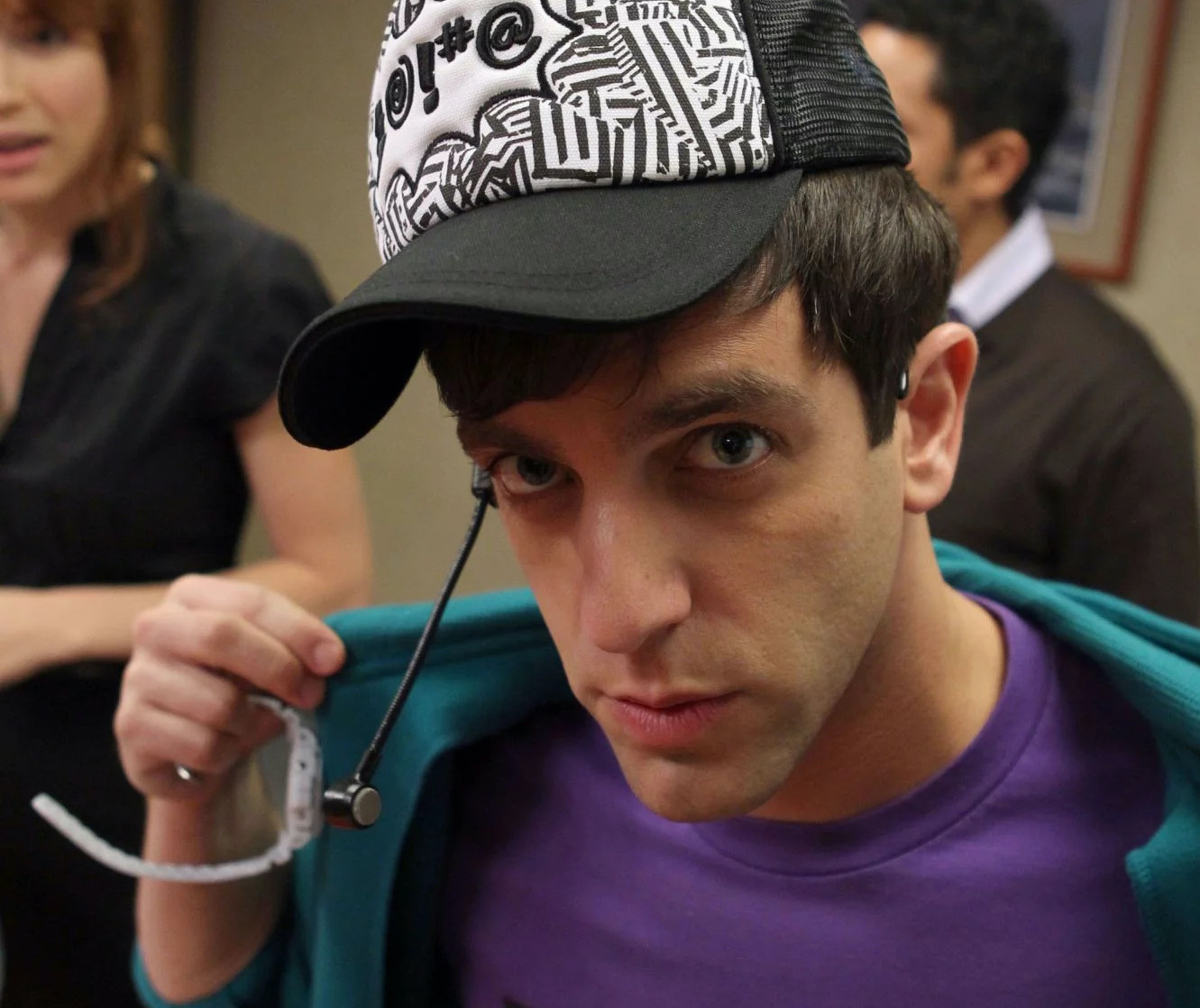
<ks-tab tab-text="Dave">
<img src="/images/demo/costumes/jim_as_dave.jpg" alt="jim dressed as dave" />
</ks-tab>
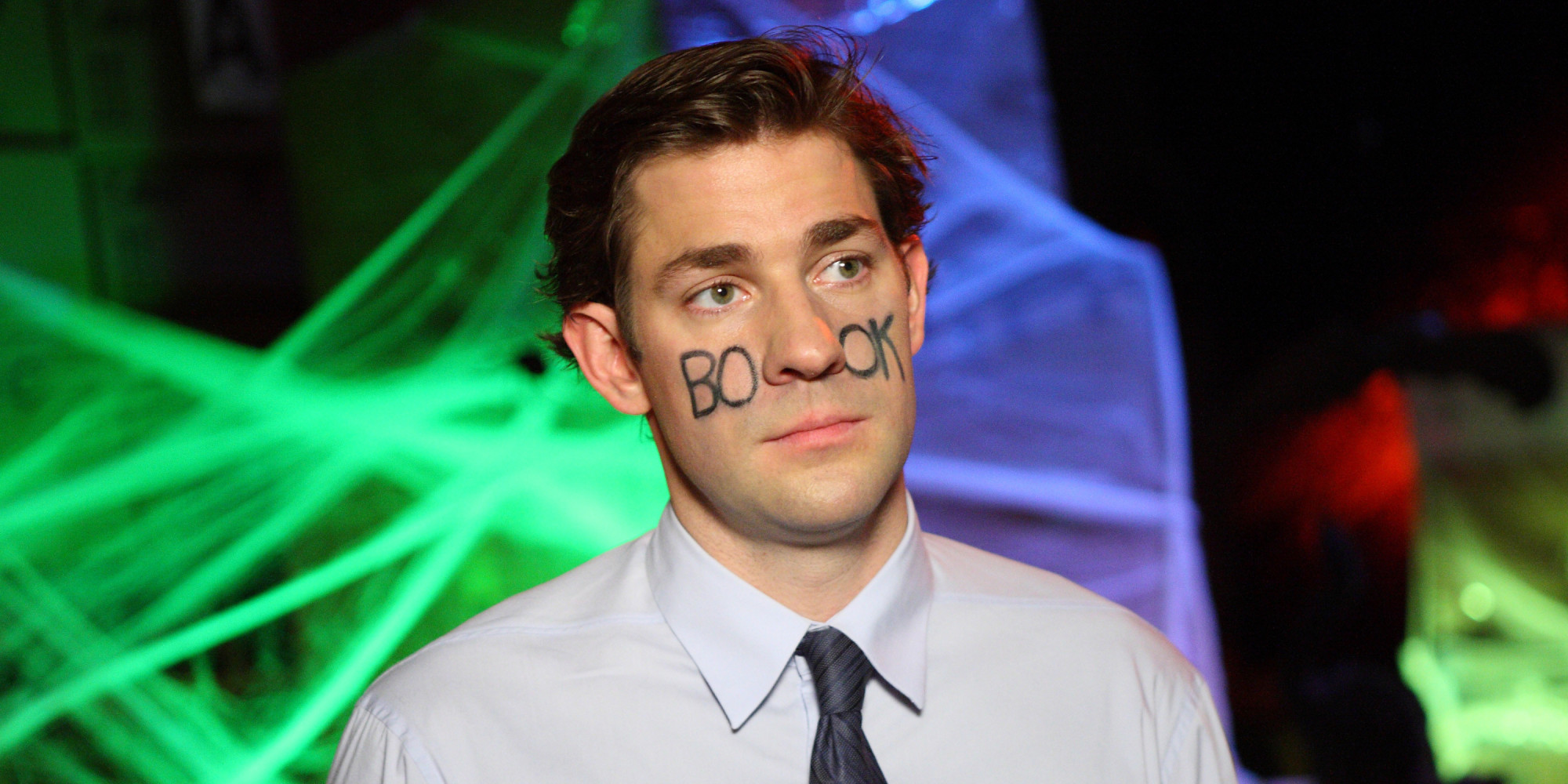
<ks-tab tab-text="Facebook">
<img src="/images/demo/costumes/jim_as_facebook.jpg" alt="jim dressed as facebook" />
</ks-tab>
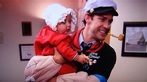
<ks-tab tab-text="Popeye <ks-badge class='ml-sm'>New</ks-badge>">
<img src="/images/demo/costumes/jim_as_popeye.jpeg" alt="jim dressed as popeye" />
</ks-tab>
</ks-tabs>
NOTE
As you can see in the last tab, the tab-text attribute supports markup to increase functionality and flexibility.
# Positioning
You can configure the position of the tabs using the position property. The available options are top, bottom, left, or right.
# Left
<ks-tabs position="left">
<ks-tab tab-text="Dwight">
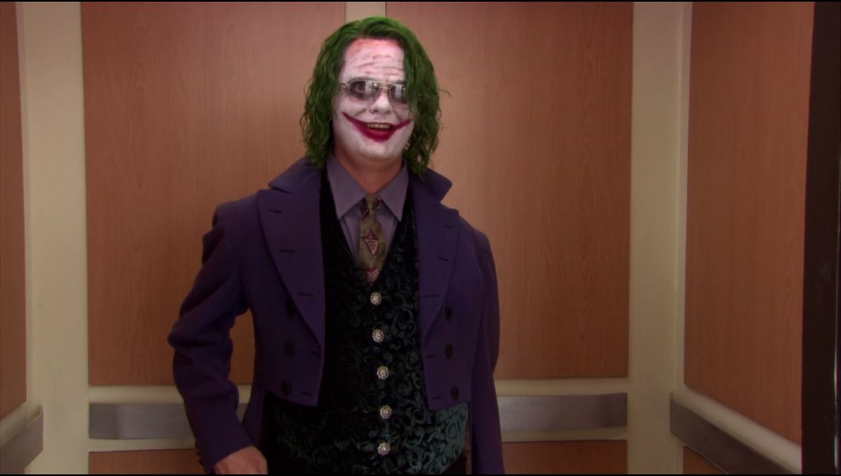
<img src="/images/demo/costumes/dwight_joker.jpg" alt="Dwight dressed as The Joker" />
</ks-tab>
<ks-tab tab-text="Creed">
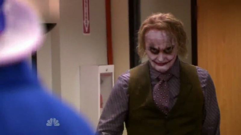
<img src="/images/demo/costumes/creed_joker.jpg" alt="Creed dressed as The Joker" />
</ks-tab>
<ks-tab tab-text="Kevin">
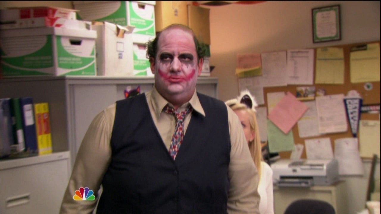
<img src="/images/demo/costumes/kevin_joker.jpg" alt="Kevin dressed as The Joker" />
</ks-tab>
</ks-tabs>
# Right
<ks-tabs position="right">
<ks-tab tab-text="Black Widow">
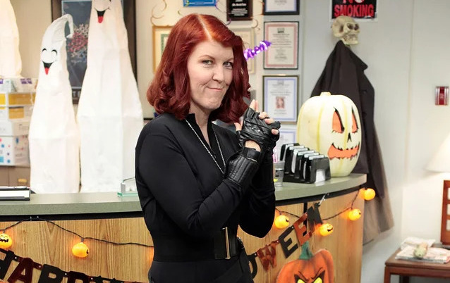
<img src="/images/demo/costumes/black_widow.jpg" alt="Meredith dressed as Black Widow" />
</ks-tab>
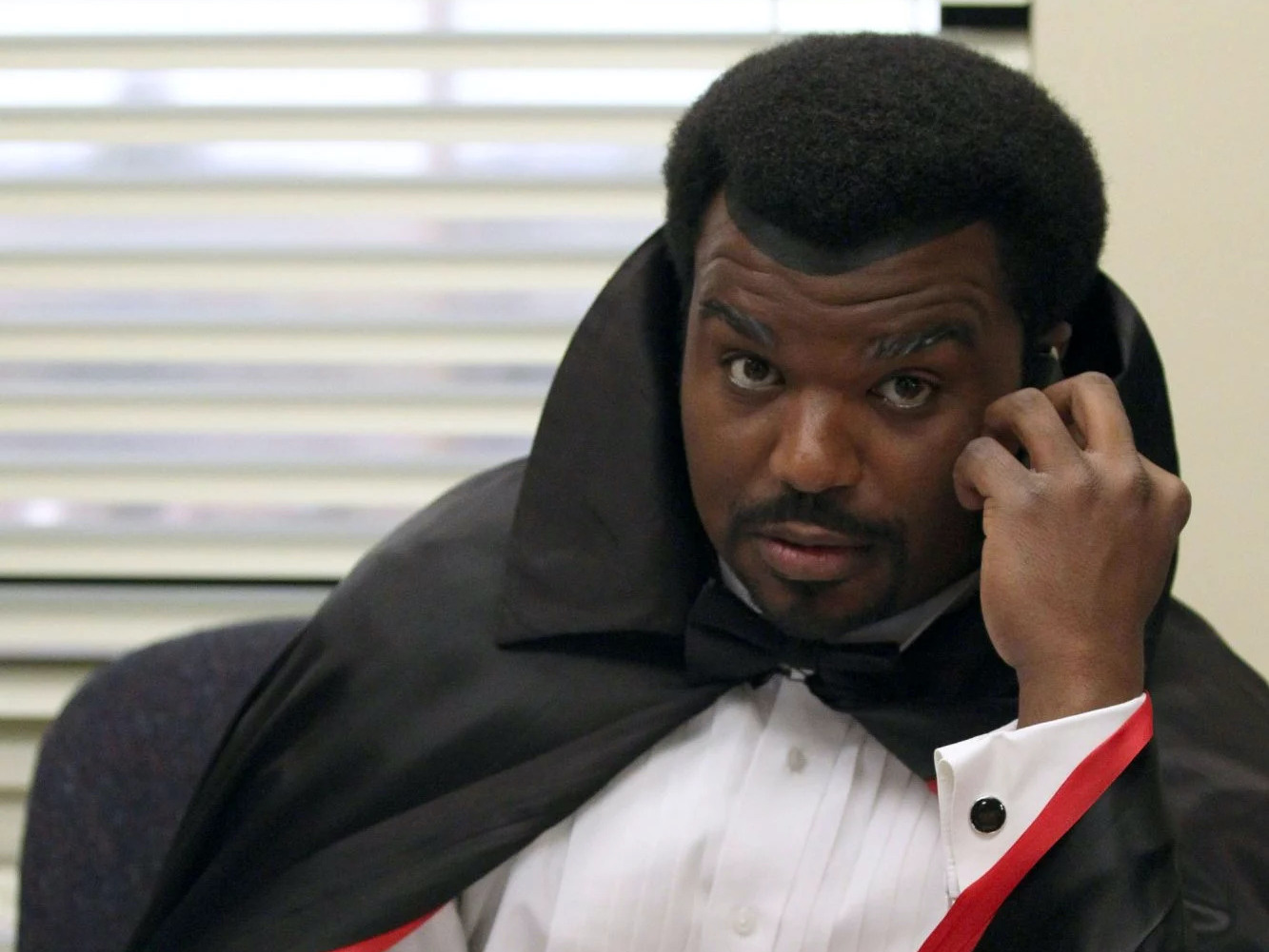
<ks-tab tab-text="Dracula">
<img src="/images/demo/costumes/dracula.jpg" alt="Daryl dressed as Dracula" />
</ks-tab>
<ks-tab tab-text="Justin Bieber">
<img src="/images/demo/costumes/justin_bieber.jpg" alt="Ryan dressed as Justin Bieber" />
</ks-tab>
</ks-tabs>
# Bottom
<ks-tabs position="bottom">
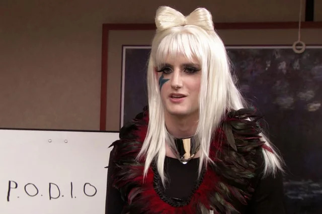
<ks-tab tab-text="Lady Gaga">
<img src="/images/demo/costumes/lady_gaga.jpg" alt="Gabe dressed as Lady Gaga" />
</ks-tab>
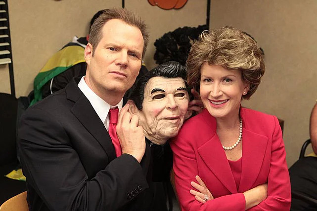
<ks-tab tab-text="Nancy Reagan">
<img src="/images/demo/costumes/nancy_reagan.jpg" alt="Angela dressed as Nancy Reagan" />
</ks-tab>
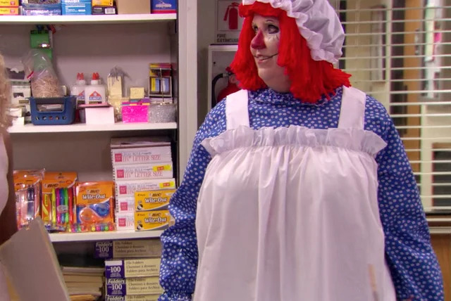
<ks-tab tab-text="Raggedy Ann">
<img src="/images/demo/costumes/raggedy_ann.jpg" alt="Phillis dressed as Raggedy Ann" />
</ks-tab>
</ks-tabs>
# Alignment
You can also control the alignment of the tabs within the tab-list container using the align property. The available options are start, center, end, and justified. Tabs will be aligned at the start of the container by default.
# Start
<ks-tabs align="start">
    <ks-tab tab-text="Dwight">
        <img src="/images/demo/costumes/dwight_joker.jpg" alt="Dwight dressed as The Joker" />
    </ks-tab>
    <ks-tab tab-text="Creed">
        <img src="/images/demo/costumes/creed_joker.jpg" alt="Creed dressed as The Joker" />
    </ks-tab>
    <ks-tab tab-text="Kevin">
        <img src="/images/demo/costumes/kevin_joker.jpg" alt="Kevin dressed as The Joker" />
    </ks-tab>
</ks-tabs>
# Center
<ks-tabs align="center">
    <ks-tab tab-text="Black Widow">
        <img src="/images/demo/costumes/black_widow.jpg" alt="Meredith dressed as Black Widow" />
    </ks-tab>
    <ks-tab tab-text="Dracula">
        <img src="/images/demo/costumes/dracula.jpg" alt="Daryl dressed as Dracula" />
    </ks-tab>
    <ks-tab tab-text="Justin Bieber">
        <img src="/images/demo/costumes/justin_bieber.jpg" alt="Ryan dressed as Justin Bieber" />
    </ks-tab>
</ks-tabs>
# End
<ks-tabs align="end">
    <ks-tab tab-text="Lady Gaga">
        <img src="/images/demo/costumes/lady_gaga.jpg" alt="Gabe dressed as Lady Gaga" />
    </ks-tab>
    <ks-tab tab-text="Nancy Reagan">
        <img src="/images/demo/costumes/nancy_reagan.jpg" alt="Angela dressed as Nancy Reagan" />
    </ks-tab>
    <ks-tab tab-text="Raggedy Ann">
        <img src="/images/demo/costumes/raggedy_ann.jpg" alt="Phillis dressed as Raggedy Ann" />
    </ks-tab>
</ks-tabs>
# Justified
<ks-tabs align="justified">
    <ks-tab tab-text="Three Hole Punch Jim">
        <img src="/images/demo/costumes/three_hole_punch_jim.jpg" alt="three-hole-punch jim" />
    </ks-tab>
    <ks-tab tab-text="Dave">
        <img src="/images/demo/costumes/jim_as_dave.jpg" alt="jim dressed as dave" />
    </ks-tab>
    <ks-tab tab-text="Facebook">
        <img src="/images/demo/costumes/jim_as_facebook.jpg" alt="jim dressed as facebook" />
    </ks-tab>
    <ks-tab tab-text="Popeye">
        <img src="/images/demo/costumes/jim_as_popeye.jpeg" alt="jim dressed as popeye" />
    </ks-tab>
</ks-tabs>
# Accessibility
A number of features have been added to the tab components to make tabs more identifiable and accessible for assistive technologies:
- The tab buttons are wrapped in a
<div>withrole="tablist"to identify the available tab options. - Each of the tab buttons has
role="tab"and usesaria-controlsto associate the tab with the tab panel. - The
<ks-tab>component hasrole="tabpanel"and uses thearia-labelledbyto use the tab content to describe the tab. - Having to tab through each of the tab options can be tedious for keyboard users, so when users are focused on tabs, they can use the ← (left) and → (right) arrow keys to select different tabs.
# Properties
# <ks-tabs>
| Property | Attribute | Description | Type | Default |
|---|---|---|---|---|
position | position | the position of the tabs around the tab content | top, bottom, left, or right | top |
align | align | the alignment if the tabs | start, center, end, or justified | start |
# <ks-tab>
| Property | Attribute | Description | Type | Default |
|---|---|---|---|---|
tabText | tab-text | the text that will display in the tab button | string | undefined |