# Form Field
Forms are some of the most complex user interactions in modern application development. The Kickstand UI form field component is designed to abstract away some of that complexity and provide a consistent user experience as well as some features to improve usability.
One of the primary goals of Kickstand UI is to take advantage of native browser functionality as often as possible, so the <ks-form-field> component leverages HTML5 input elements and validation to reduce code size increase functionality.
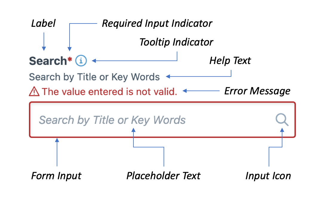
Below is a diagram of the various parts of the Kickstand UI Form Field component. The documentation below will go into each feature in more detail.
# Label
The label property provides the label for your form field. This property is also used to create the name of the input field if one is not specified (the label will be converted to kebab-case as a default naming convention).
WARNING
Every form field must have a label for usability purposes and placeholder text is not a suitable replacement for a label.
# Hide Label
There are times where the context may be enough to allow you to get away without an explicit label on the input field (a search field, for example). Rather than omit the label, you can hide it for sighted users using the hide-label property.
<ks-form-field label="search by product id" placeholder="Search by product ID..." icon="search" hide-label></ks-form-field>
NOTE
This should be only sone on the rarest of exceptions. If possible, an explicit/visible label should be used to improve the user experience.
# Help Text
The help-text is additional information provided for the user to increase input accuracy. Developers have commonly used placeholder text for this information in the past, but this results in some usability issues which include:
- the loss of that information when a value is input into the field
- accessibility issues with color contrast
- overflow text is hidden on smaller screen resolutions
- if users mistake the placeholder as an input value it can create a false sense of completion
# Usability
To improve usability, the help text is displayed above the form field and is actually part of the <label>. By doing this:
- Assistive technologies will read the help text with the label
- On-screen keyboards will not cover up help text that may appear below the input field
- Clicking a label automatically sets the focus on associated input field, so having your help text as part of your label provides a larger target to interact with the form field – especially for touch-enabled devices
<ks-form-field
    label="Password"
    type="password"
    help-text="Must contain at least 8 characters"
    minlength="8">
</ks-form-field>
# Tooltip Text
If you need to provide the user with additional information that may not need to be displayed every time a user interacts with the form, you can display it in a tooltip.
<ks-form-field
    label="Email"
    type="email"
    tooltip-text="Used for password recovery"
    tooltip-size="md">
</ks-form-field>
NOTE
You can customize the label assigned to the icon using the tooltip-label property
# Input Icon
To improve usability, icons can be added to your input specifying an icon name in the icon property.
<ks-form-field
    label="Email"
    type="email"
    icon="email">
</ks-form-field>
You can also adjust the location of the icon using the icon-direction property. The options are "left" and "right" and the default value is "right".
<ks-form-field
    label="Email"
    type="email"
    icon="email"
    icon-direction="left">
</ks-form-field>
# Sizes
The form fields come in 2 sizes - small, medium, and large. These sizes match the corresponding button sizes if you are using the inline form feature.
<ks-form-field label="Small Input" size="sm"></ks-form-field>
<ks-form-field label="Medium Input (Default)" size="md"></ks-form-field>
<ks-form-field label="Large Input" size="lg"></ks-form-field>
# Error Messages
In order to provide clear error messages to you users, invalid input fields will be bordered in red and the error message will also be display in red to help it stand out from the label and help text. For those users that may not be able to distinguish between the colors, an "alert" icon has been added to call attention to the invalid field and message.
Note
The error message is also included in the <label> to provide better usability.
# Validation
With implementation of HTML 5, there are a number of great validation tools that come out-of-the-box for form fields. Kickstand UI takes advantage of those capabilities and provides some additional features for custom validation.
# Validation Properties
Each fo the validation properties has a corresponding error message you can easily customize.
| Validation | Error Message | Usage |
|---|---|---|
value | bad-input-error-message | This error will display if the user has provided input that the browser is unable to convert. |
invalid | default-error-message | Provides the ability to manually toggle the input's validity. |
max | max-error-message | Specifies the maximum value of numerical input types |
maxlength | maxlength-error-message | Specifies the maximum length of textual data (strings) |
min | min-error-message | Specifies the minimum value of numerical input types |
minlength | minlength-error-message | Specifies the minimum length of textual data (strings) |
pattern | pattern-error-message | Specifies a regular expression that defines a pattern the entered data needs to follow. |
required | required-error-message | Specifies whether a form field needs to be filled in before the form can be submitted. |
step | step-error-message | Specifies what increment the value will go up or down by when the input controls are used (such as the up and down number buttons). |
type | type-error-message | Specifies whether the data needs to be a number, an email address, or some other specific preset type. |
TIP
To find out more about HTML5 form validation check out this documentation from MDN (opens new window).
# Validate On Input
By default the form field will be validated once the user leaves the form field (onBlur). If you need to override this behavior to when the user presses the key (onInput), you can add the validate-on-input property to override the default behavior.
# validate()
You can also manually trigger field validation by selecting the field and executing the validate() method.
<ks-form-field id="username" label="Username" required></ks-form-field>
<script>
    let $username = $('username');
    $username.validate();

    // you can also get the field data
    $username.validate().then(fieldData => {
        // do something awesome with the fieldData
    });

    // or
    const fieldData = await $username.validate();
</script>
# Data Binding
Kickstand UI's components use one-way data binding so that data flows in a single direction. What that means is that the variable you bind to the value property will not be updated whenever a user enters new content. In order to provide you with the new value, each component will emit and updated event.
# Adding Event Listeners
<ks-form-field label="Name" id="binding_test" class="mb-md"></ks-form-field>
<b>Bound Value: </b><span id="bound_value"></span>
<script>
    $('#binding_test').on('updated', (e) => {
        $('#bound_value').innerText = e.detail.value;
    });
</script>
# Using Javascript Frameworks
Many JavaScript frameworks come with built-in event handling to help simplify your code.
# Vue.js
<ks-form-field label="Name" id="binding_test" @updated="(e) => myMethod(e)"></ks-form-field>
# React
<ks-form-field label="Name" id="binding_test" onUpdated="(e) => onUpdatedHandler(e)"></ks-form-field>
# Event Detail
Event details emit much more that just the value. If you take a look, you will se that it not only emits the value of the field, but also the ValidityState (opens new window) and isValid for a quick identifier for validity. This should provide you with more information to manage form validation.
{
    name: "email",
    value: "michael.scott@dundermifflin.com",
    isValid: true,
    validity: {
        badInput: false
        customError: false
        patternMismatch: false
        rangeOverflow: false
        rangeUnderflow: false
        stepMismatch: false
        tooLong: false
        tooShort: false
        typeMismatch: false
        valid: true
        valueMissing: false
    }
}
# Inline
You can move labels to be inline with the input.
<ks-form-field label="Username" inline></ks-form-field>
Note
The labels are positioned above the input field to improve usability and form completion (opens new window), but there are instances where having the label inline with the input is very useful. If you are using the inline property for aesthetic reasons, please reconsider.
# Debounce
Debouncing is a technique to help improve the performance of your application. The idea is to delay time-consuming tasks until the user is done doing what they are doing.
For example, if you have an input that performs a server-side action when the user types into an input, you may want to wait until the user is finished typing before you perform the action rather than each time they press a key.
<ks-form-field id="with_debounce" debounce="1000" label="With Debounce" />
<ks-form-field id="without_debounce" label="Without Debounce" />

<script>
    $('#with_debounce').on('updated', function(e) {
        alert(`I waited until you finished entering: ${e.detail.value}`);
    });

    $('#without_debounce').on('updated', function(e) {
        alert(`You entered: ${e.detail.value}`);
    });
</script>
# Accessibility
Accessibility was paramount when the Form Field component was designed. Most of the elements of this component utilize native browser features, but the features that have been added were designed with usability and accessibility in mind.
These features include:
- Inputs all use IDs, names, and labels.
- Labels are explicitly associated to with inputs using the
forattribute. - Labels, Help Text, and Error Messages all display above the input to prevent the on-screen keyboard from blocking important text.
- Error messages use
role="alert"with thearia-live="assertive"to announce when validation errors occur - Error messages are accompanied with an icon to help users who cannot distinguish the error message based on color.
- Default input validation occurs when the user leaves the field in order to prevent premature invalid responses. If a form field is
invalidthe validation will then occur on input to provide realtime feedback to the user when the issue is resolved.
# Properties
| Property | Attribute | Description | Type | Default |
|---|---|---|---|---|
autocomplete | autocomplete | check out the documentation (opens new window) for more information on available values and features | string | on |
badInputErrorMessage | bad-input-error-message | the message that displays when the badInput validation is true | string | There was a problem processing your value. |
defaultErrorMessage | default-error-message | the message that will display if invalid is set to true | string | The value entered is not valid. |
disabled | disabled | disable form fields | boolean | false |
inline | inline | move labels to be inline with input | boolean | false |
helpText | help-text | additional information that displays below the form label | string | undefined |
invalid | invalid | toggles whether the form is valid or not | boolean | false |
label | label | the form field label | string | undefined |
hideLabel | hide-label | hides input label | boolean | false |
max | max | the max value for number and spin-box input types | number | undefined |
maxErrorMessage | max-error-message | the error message that will display if the max value has been exceeded | string | Your value must be no greater than {max}. |
maxlength | maxlength | the maximum number of characters a field will allow | number | undefined |
maxlengthErrorMessage | maxlength-error-message | the error message that will display if the maxlength value is exceeded | string | Your value must be no more than {maxlength} characters. |
min | min | the min value for number and spin-box input types | number | undefined |
minErrorMessage | min-error-message | the error message that will display if the value is less than the min | string | Your value must be no less than {min}. |
minlength | minlength | the minimum number of characters the value must be | number | undefined |
minlengthErrorMessage | minlength-error-message | the error message that is displayed if the value length is less than the minlength | string | Your value must be at least {minlength} characters. |
pattern | pattern | a regular expression used validate the value | string | undefined |
patternErrorMessage | pattern-error-message | the error message displayed if the value does not match the pattern | string | There was a problem processing the value. |
placeholder | placeholder | placeholder text that will display within the form field | string | undefined |
required | required | toggles whether the form field is required | boolean | undefined |
requiredErrorMessage | required-error-message | the error message displayed if required is true and is missing a value | string | This field is required. |
requiredText | required-text | the text that will display when the required indicator is hovered or screen readers read the indicator | string | 'Required' |
step | step | when using a spin-box the amount it will increment/decrement | number | undefined |
stepErrorMessage | step-error-message | the error message that will display if the value is not divisible by the step value | string | This field is required. |
tooltipText | tooltip-text | if set, an indicatory will appear and when hovered/focused on will display this content in a tooltip (supports HTML) | string | undefined |
tooltipSize | tooltip-size | set the size of the tooltip | sm, md, lg, or xl | sm |
tooltipLabel | tooltip-label | the label assigned to the tooltip icon | string | "additional information" |
type | type | the input type | "date", "email", "hidden", "number", "password", "search", "textarea", "tel", "text", or "url" | 'text' |
typeErrorMessage | type-error-message | the error message that will display if the value does not match the input type | string | Your value must be a valid {type}. |
value | value | the input value | number or string | '' |
validateOnInput | validate-on-input | toggles the validation timing at time of input | boolean | false |
icon | icon | icon displayed in the input field | string | undefined |
iconDirection | icon-direction | determines the position of the icon | "left" or "right" | "right" |
inputClass | input-class | Adds classes directly on the input element | undefined |
# Events
| Event | Description | Type |
|---|---|---|
blurred | Adds event listener for the onBlur event of input field | CustomEvent<any> |
updated | this event will execute each time the value is updated | CustomEvent<{ isValid: boolean, validity: ValidityState; value: string \| number; }> |
# Methods
# validate() => Promise<IFormFieldData>
# Returns
Type: Promise<IFormFieldData>
← Form Autocomplete →